CABRUCACAO CHOCOLATE –
CATEGORY
Packaging
OBJECTIVES
Chocolate Branding
Sustainable Packaging
Culturally Representative
TYPEFACE
Papyrus
Hand-lettered
KEY WORDS
Organic
Sustainable
Culture
Single-Source
project brief
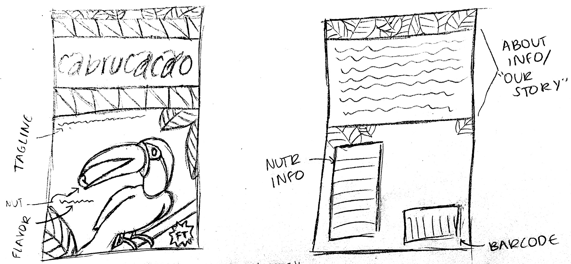
The goal for this project was to create a chocolate brand and package design that reflects the values of a fair trade, organic, single-origin, small company. The packaging is meant to send a message to consumers that conveys the culture of the country of origin, and also implies that the ingredients come from a small family farm owned by the cocoa farmers themselves. The brand must also be recognizable, yet noticeably varied, between three different flavors of chocolate.
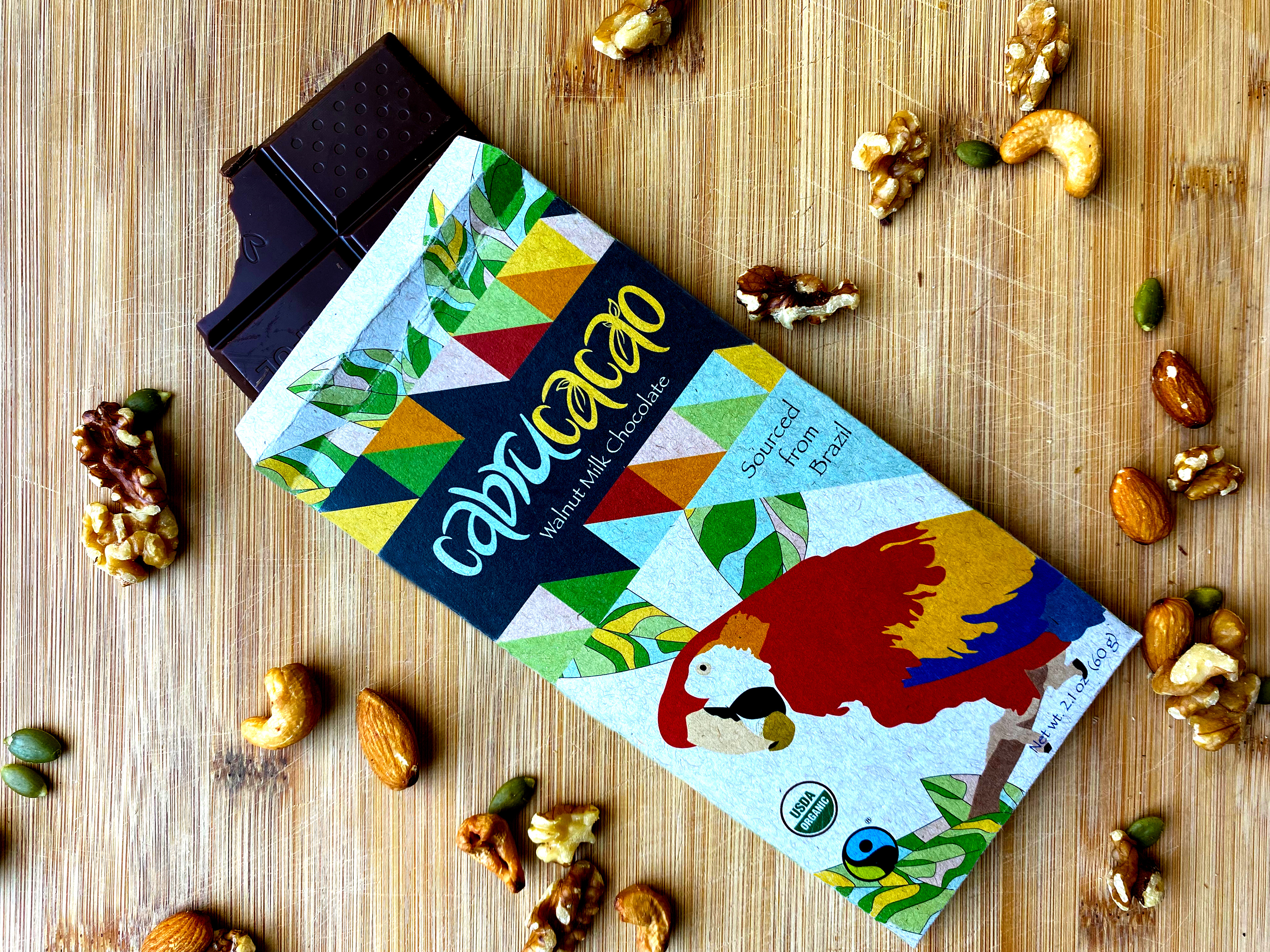
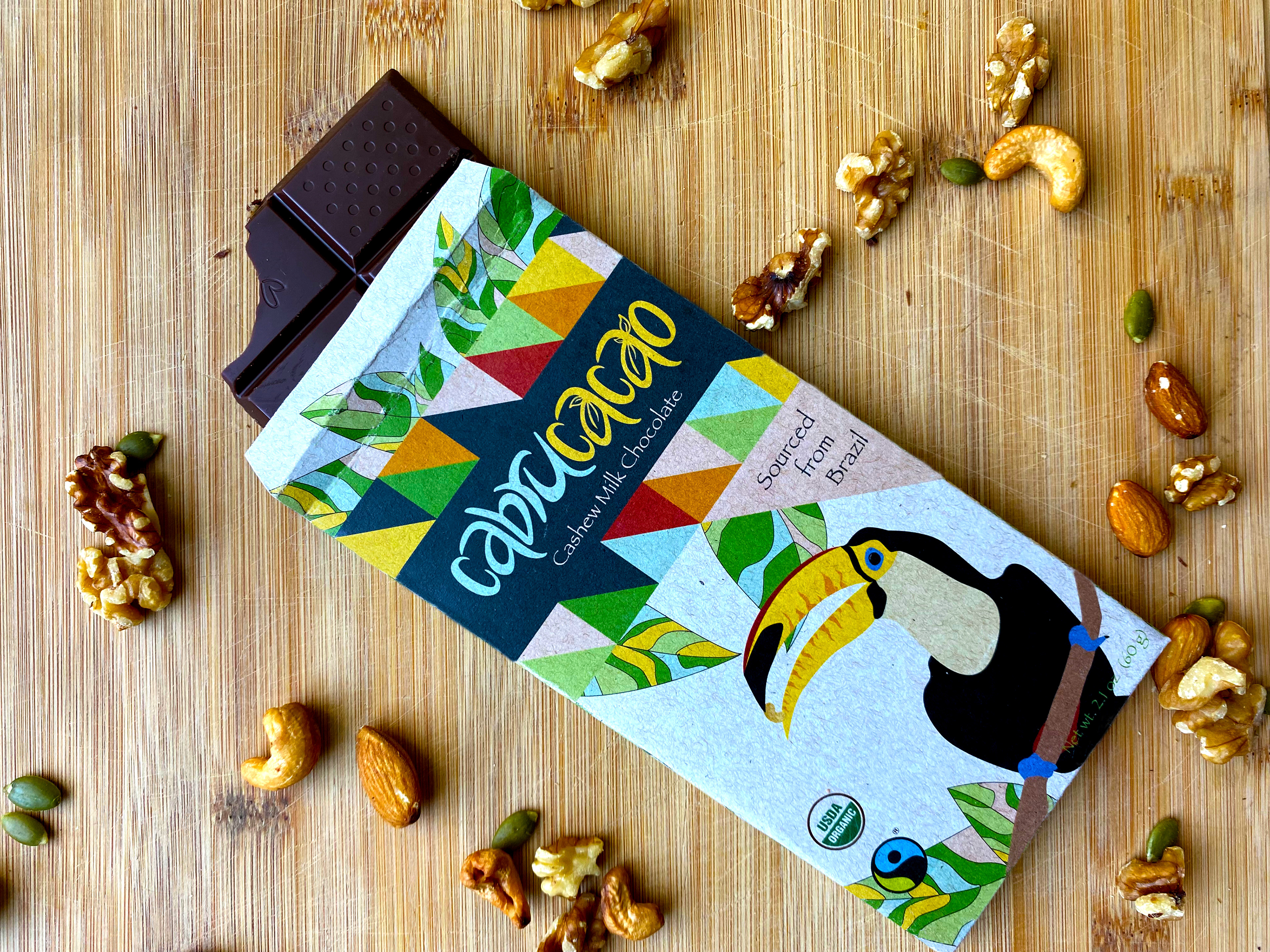
SOLUTION
My final design incorporates a combination of foliage, bright and geometric patterns, and native Brazilian birds as the main focal points. While the overall design is very colorful, representative of the colorful Brazilian culture, traditions, and festivals, the layouts are printed on earth-toned, 100% recycled paper. This results in the colors coming out slightly muted, and gives the overall appearance a more natural aesthetic. This helps convey to the consumer that this product is produced with natural, organic ingredients, and that it is not a factory-made, highly processed candy bar. While the colors in the printed design are muted, the combination of cultural colors, patterns, and native animals still remain unique to Brazil, and allow the country of origin to stay recognizable. Each bird is used to represent a different flavor, the ingredient for which they all hold in their beaks. This adds variety between the packaging for each flavor, while the consistent background and logotype ties the variations together under one brand.
