ADRIAN FRUTIGER'S GLYPHA –
CATEGORY
Typography
Poster Design
OBJECTIVES
Highlight Unique Aspects of Typeface
Cohesive Triptych Poster Set
TYPEFACE
Glypha
KEY WORDS
Typography
Font Highlight
Cohesion
project brief
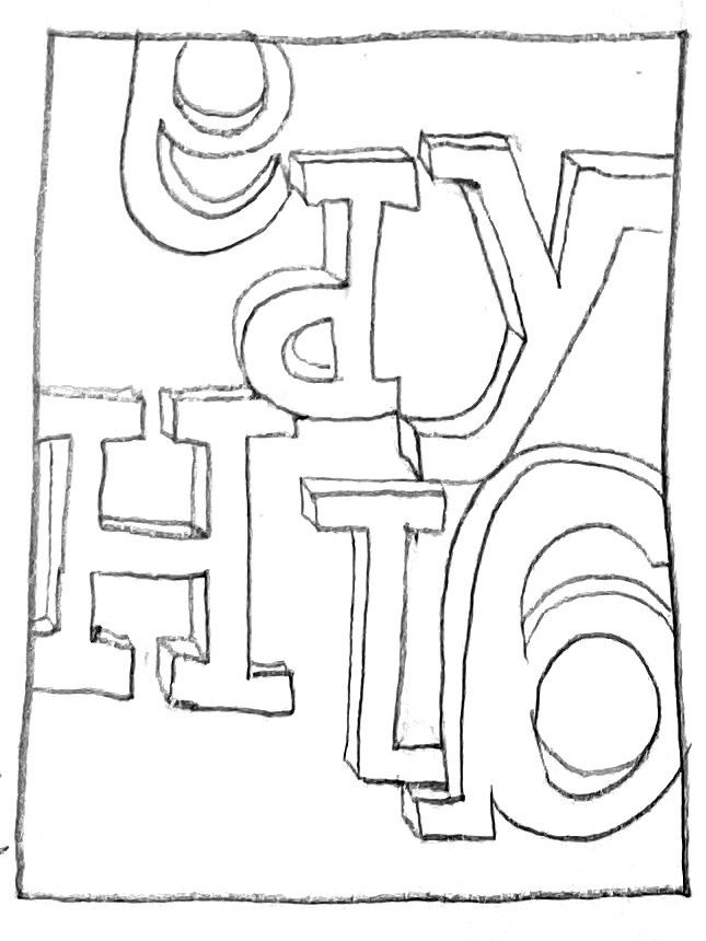
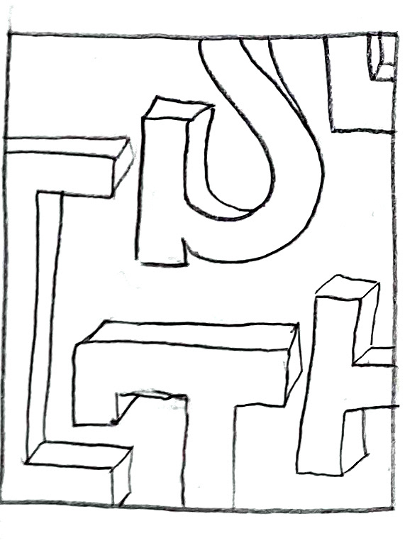
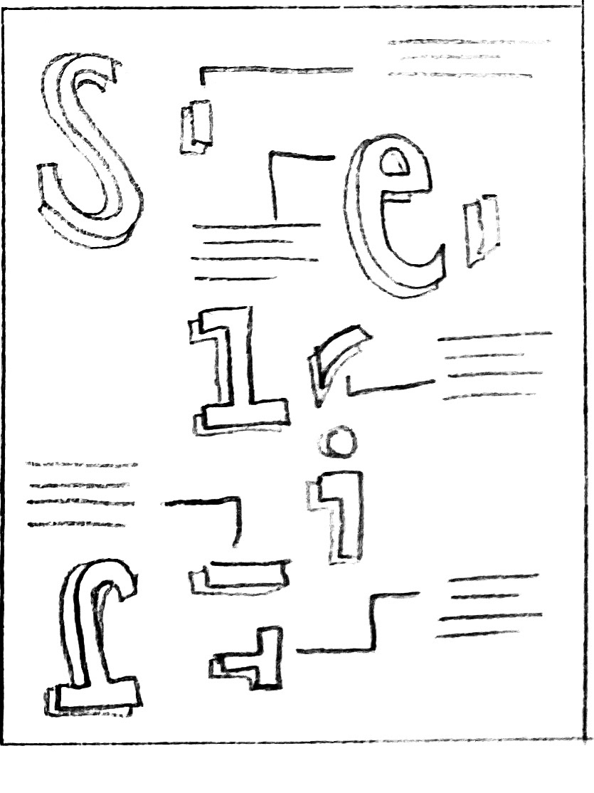
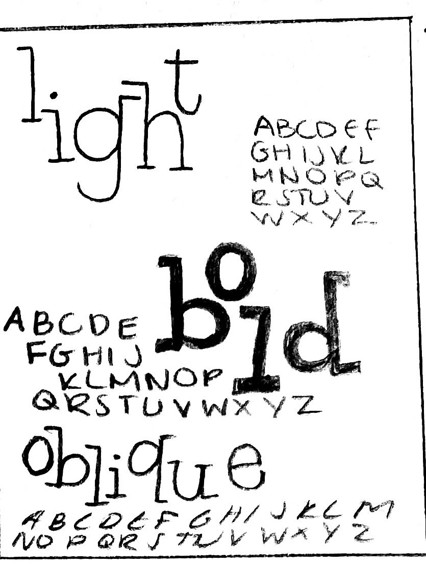
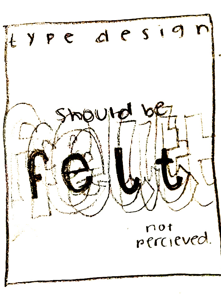
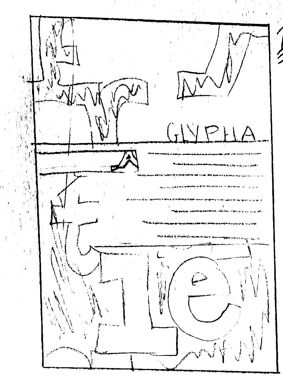
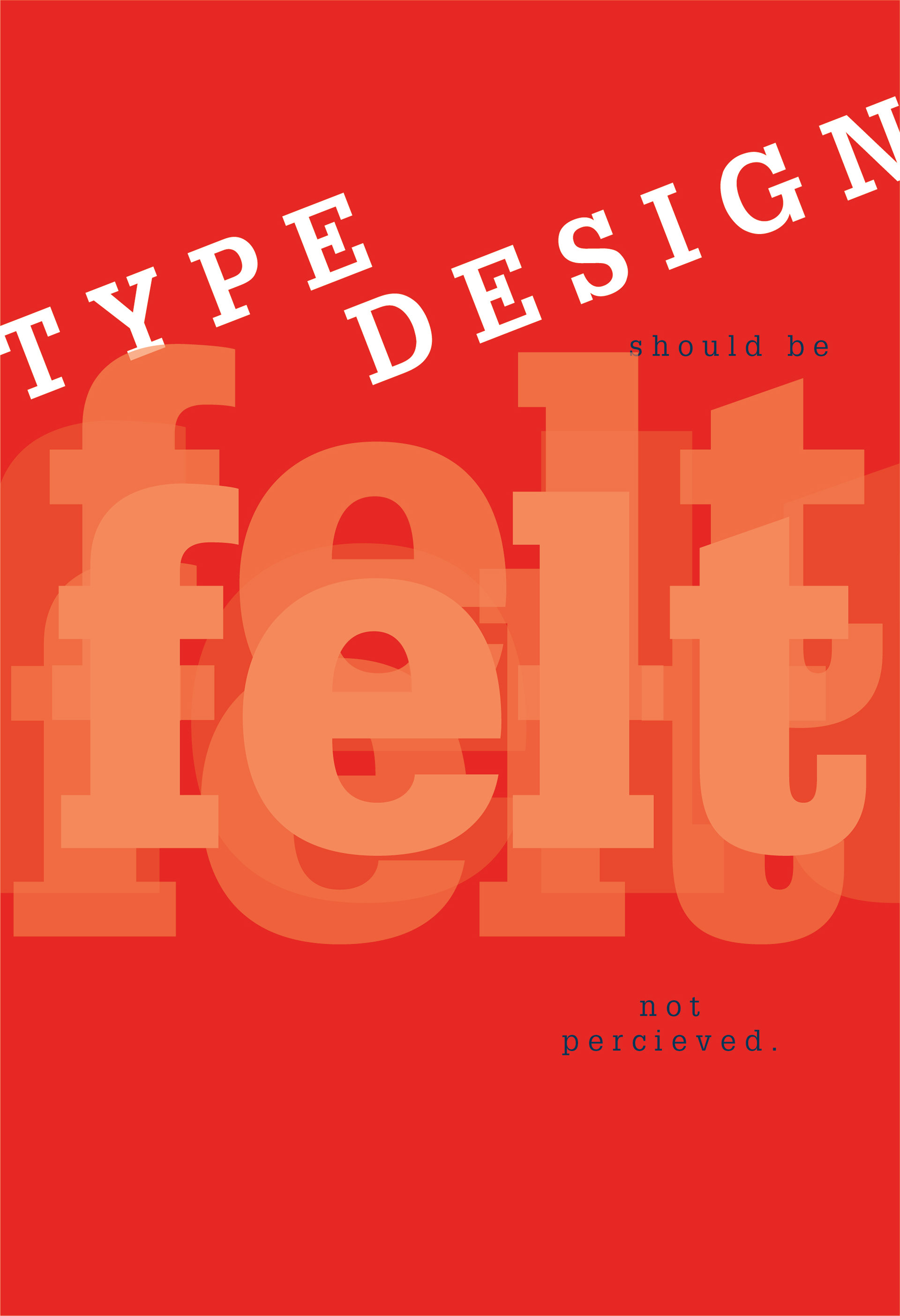
For this project, the task was to create a three-part poster series centered around a specific typeface and the typeface designer. The assignment required research regarding the type designer, their background, and the evolution of the the specific typeface. The overall objective was to establish a clear visual hierarchy, within each individual poster and in the triptych as whole, while highlighting the unique qualities of the typeface and the designer.
SOLUTION
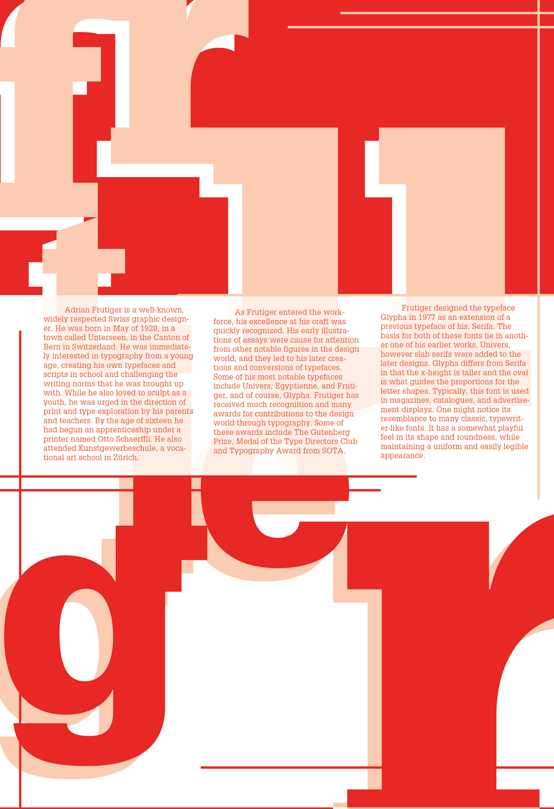
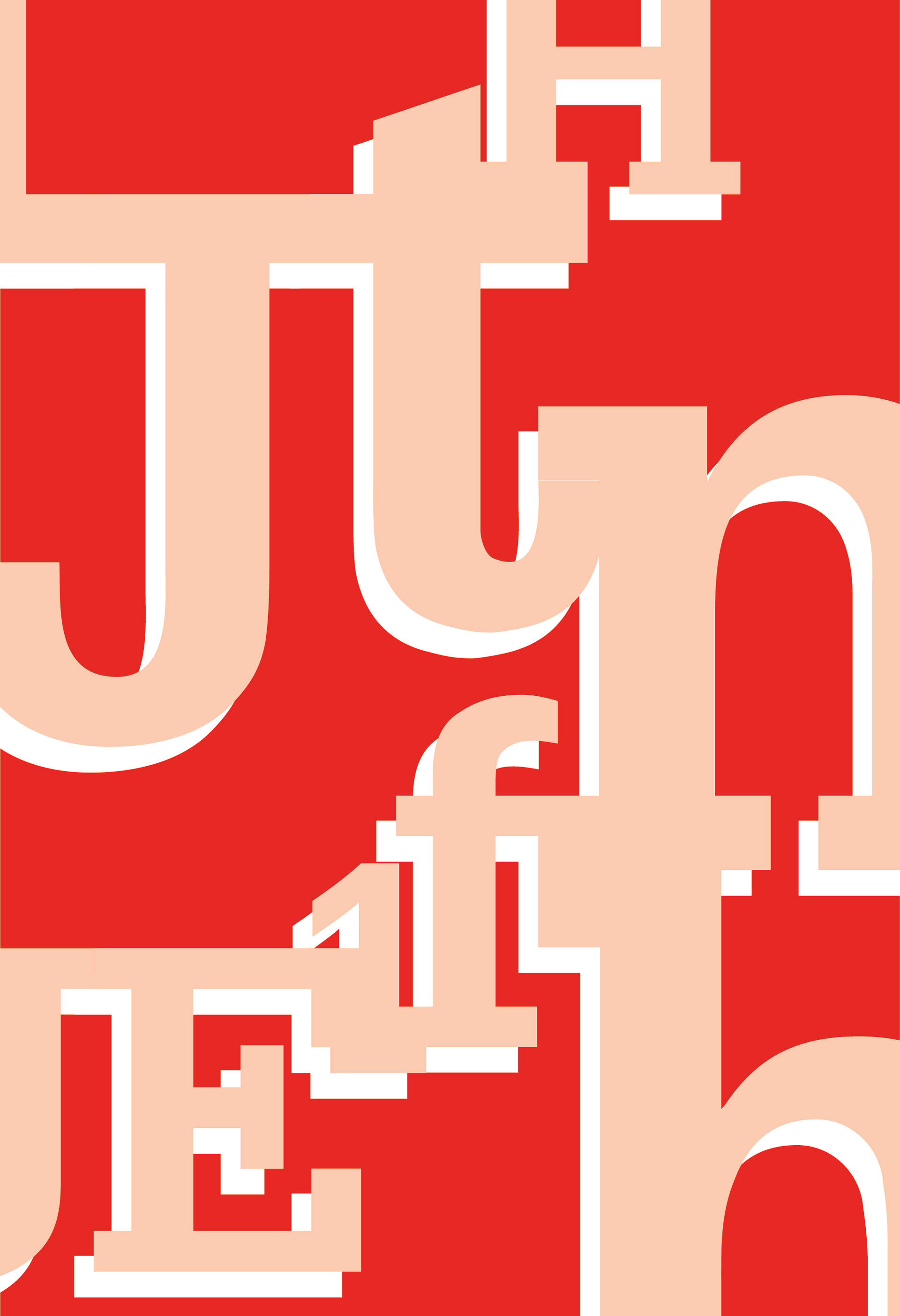
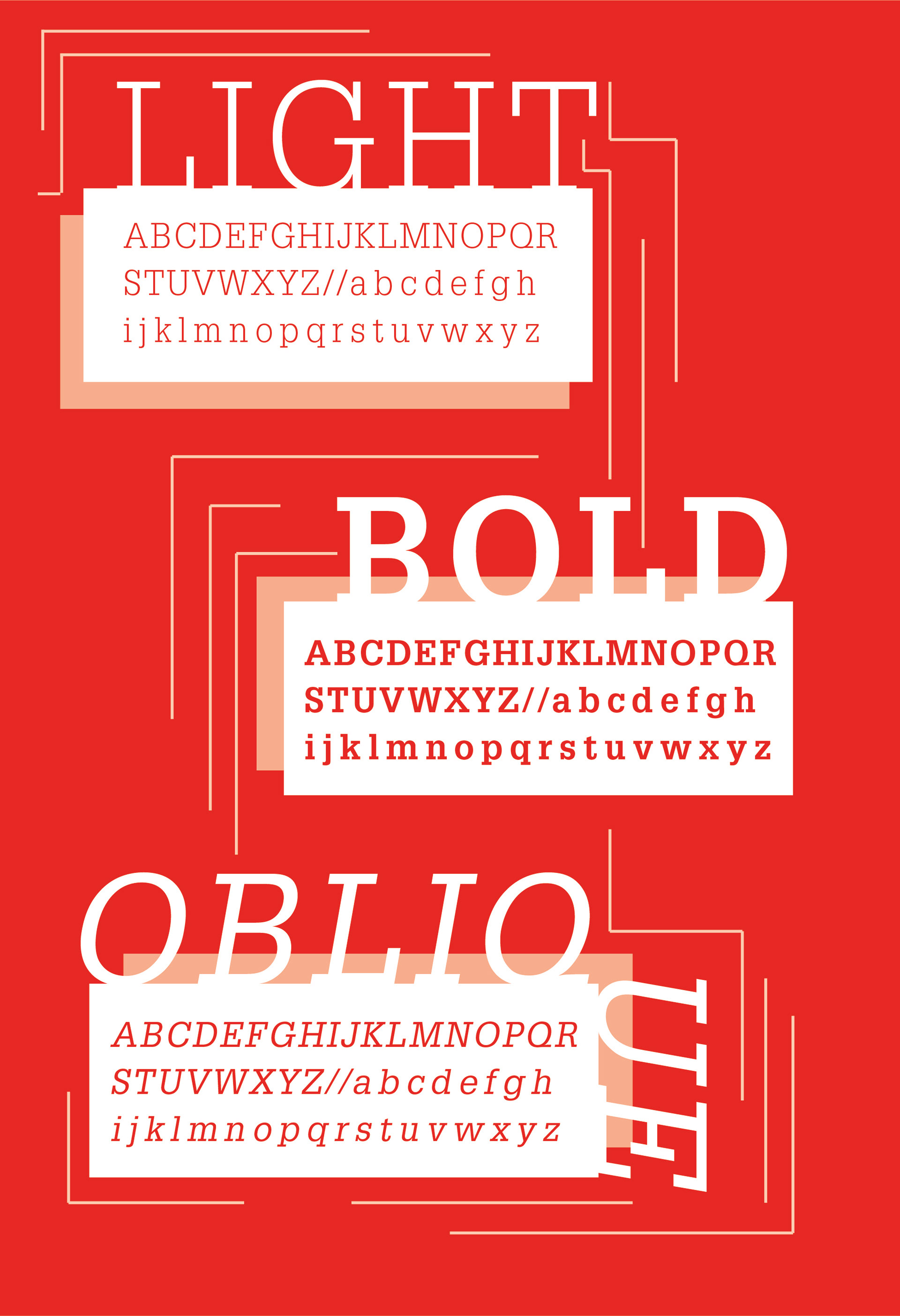
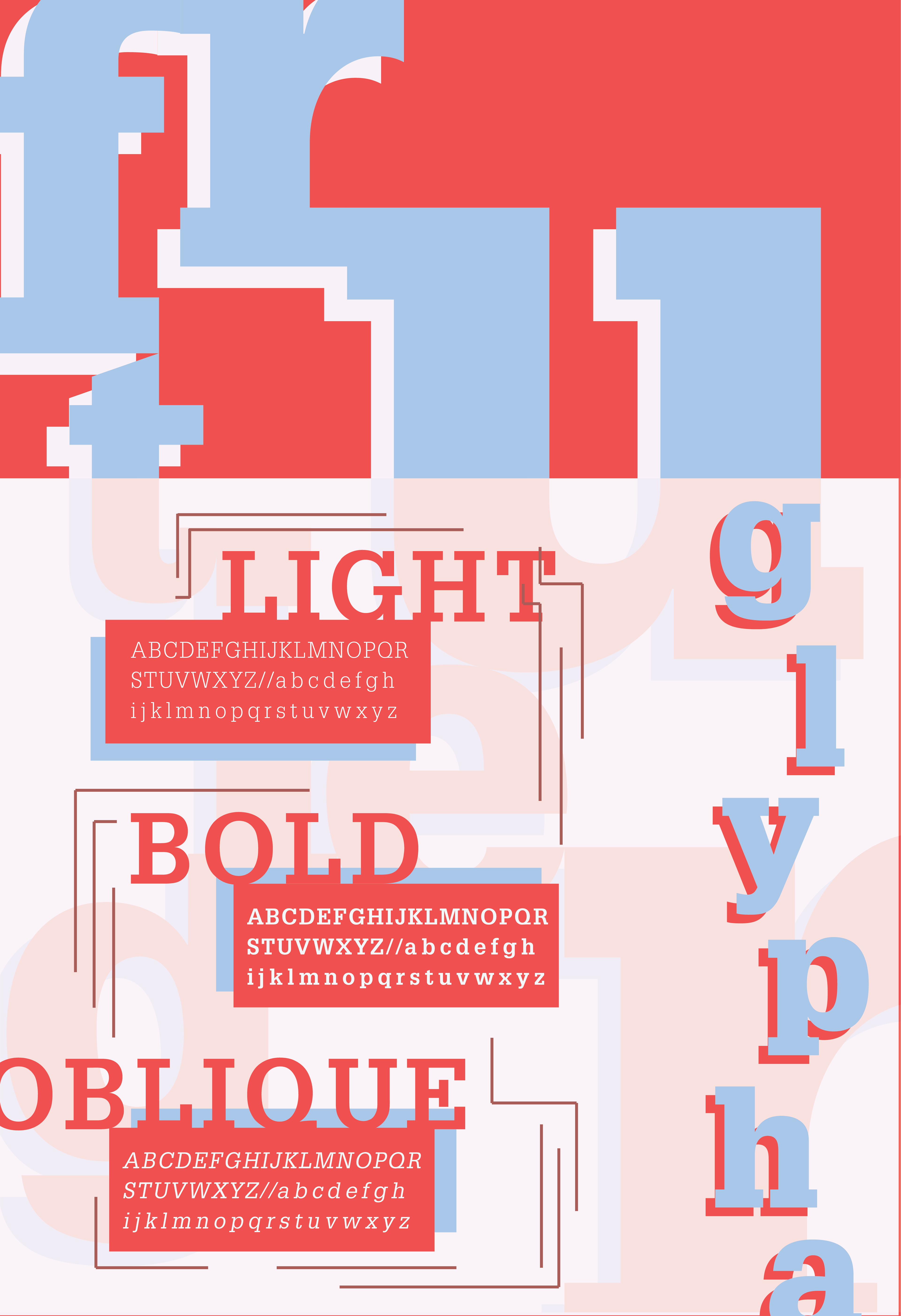
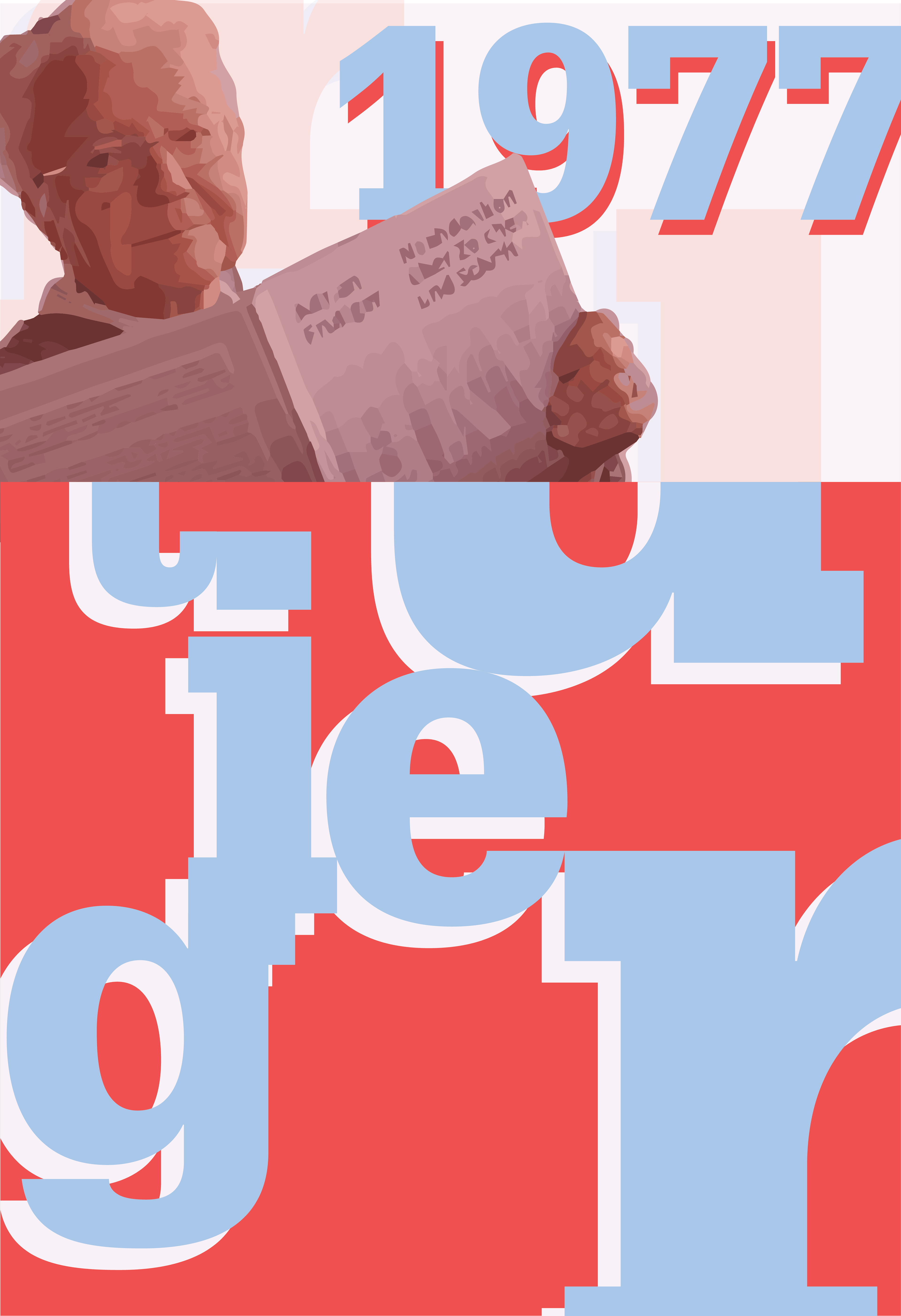
My final design is heavily geometry-based, highlighting and correlating to the geometric nature of the serif typeface, Glypha. Adrian Frutiger, creator of Glypha, has a colorful, creative background, which inspired the colors and overall aesthetic of the bright, bold, triptych poster set. The details within the posters highlight different aspects of the font, the font styles, and Frutiger's background and personality. The three pieces work together to create a cohesive depiction of both the typeface creator and the unique qualities of the font itself.
