collaborators
Julia Heimburger - Project Co-Leader
Hannah Surreda - Project Co-Leader
RIPPLE MUSIC APP –
CATEGORY
UI/UX
OBJECTIVES
User-Friendly Design
Intuitive General User Flow
Unique, Cohesive Branding
Innovative Additional User Flow
TYPEFACE
Barlow
KEY WORDS
User-Friendly
Aesthetic
Bright
Engaging
project brief
The overall goal of this project was to work as a team of UX/UI Designers for an interactive agency in San Diego that has been hired to design a mobile app. This was a collaborative project, created with fellow designer Hannah Surreda, in which we worked on both prototyping and designing solely in Figma. The project would consist of five major phases, which included user research and testing, as well as developing a fully fleshed out prototype that allowed users to experience a variety of flows.
SOLUTION
Hannah and I began this project by conducting user-research, creating a mood board and deciding on an overall aesthetic for our music application, and conducting competitive analysis. We then created user personas, representing our target demographics, created a user flow, and a low-fidelity wireframe. We did initial user tests using our low-fidelity wireframe, adjusted out flows, and then began fleshing out our high-fidelity wireframe. Once our high-fidelity frame was complete, we tested on users in our demographic once more, and made the final adjustments to our user flows. In completion, has a bold, bright interface, with all the essential, and some additional and unique, user flows.
phase 1 – RESEARCH, MAPPING, & COMPETITOR ANALYSIS
USER SURVEY (USER 1 OF 4) –
What is your favorite music application and what device do you use?
Spotify
iPhone 11
How often and what time of day do you use the app?
2-3x a day
At the gym (morning), commuting to and from class (afternoon)
What’s most appealing about the app?
Very familiar with the app
Huge selection of music
What’s the hardest part about using this app?
Doesn’t every single song she wants
Was there anything surprising or unexpected about the app?
Discovery of how personalized and thoroughly analyzed the music selection of music is that is recommended for the user
What can be done to improve the app?
Fix the shuffle (feels like every time she shuffles her songs the same songs play first)
Work on getting more underground/less popular music
What feature of the app do you use the most?
Liked songs feature
COMPETITIVE ANALYSIS: SPOTIFY –
What application are you researching?
We are researching music streaming applications, specifically Spotify.
Is it a native application, a hybrid application or a web-based application?
Spotify is a hybrid application which works on both mobile and desktop platforms.
What is the main objective of this app?
The main objective of this app is to provide a platform for users to listen to music, podcasts, and radio shows.
What is the overall tone or mission of the app?
The overall tone of this app is to appear personalized, with options tailored to the individual user. The logistical mission of this app is to have an intuitive, easy-to-follow platform for users to find what they are looking to stream. Their self-proclaimed mission is “to unlock the potential of human creativity—by giving a million creative artists the opportunity to live off their art and billions of fans the opportunity to enjoy and be inspired by it.”
What are its main features?
The main features are the library, search, home, and profile sections. The app also includes recommendations and browsing options for new content, some of which Spotify puts together based on the specific user’s history and patterns of interest.
What areas of the app are reviewed positively?
Wide variety of streaming content, personalized recommendations and playlists, very intuitive interface, good options for collaboration, social aspect - able to share your streaming history/interests, follow along lyrics
What areas of the app are reviewed negatively?
Free service has lots of ads, most of profits don’t go directly to artists, the shuffle feature is not randomized enough, and the personalized features (i.e. Discover Weekly) are not truly personalized (too random)
What is the target demographic of the app?
Ages 16-30
What is the user interface like? Does it have a Design System that it adheres to?
Simple, clean, graphics related to music/album covers, dark background color system, simple additional graphics related to specific music/artists. Spotify currently uses a Design System called Encore, which is a network of design systems consisting of bold shapes and colors, clean display setups, and more for every type/size of screen.
USER FLOW MAP: COMPETITOR –
VALUE PROPOSITION –
We are creating a platform in which users will have the unique opportunity to choose between multiple levels of privacy when creating and sharing their music, allowing them to adapt levels of publicity to their desired crowd. Along with this, we are making it easier than ever for users to select between one, twenty, or hundreds of songs at once for them to download or add to a playlist, taking away the hassle of adding songs one at a time. The user experience will be as smooth as jazz.
phase 2 – USER PERSONAS & WIREFRAMING
USER PERSONAS –

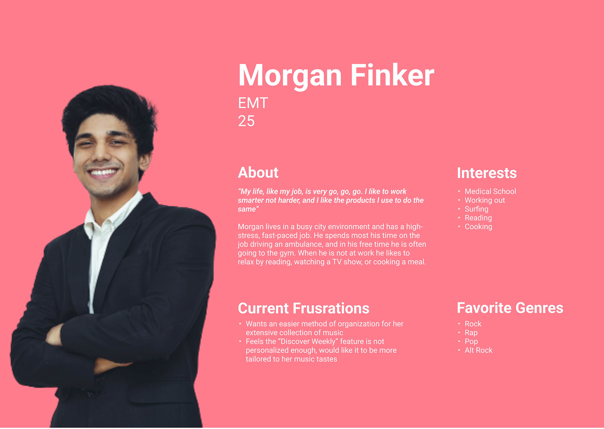
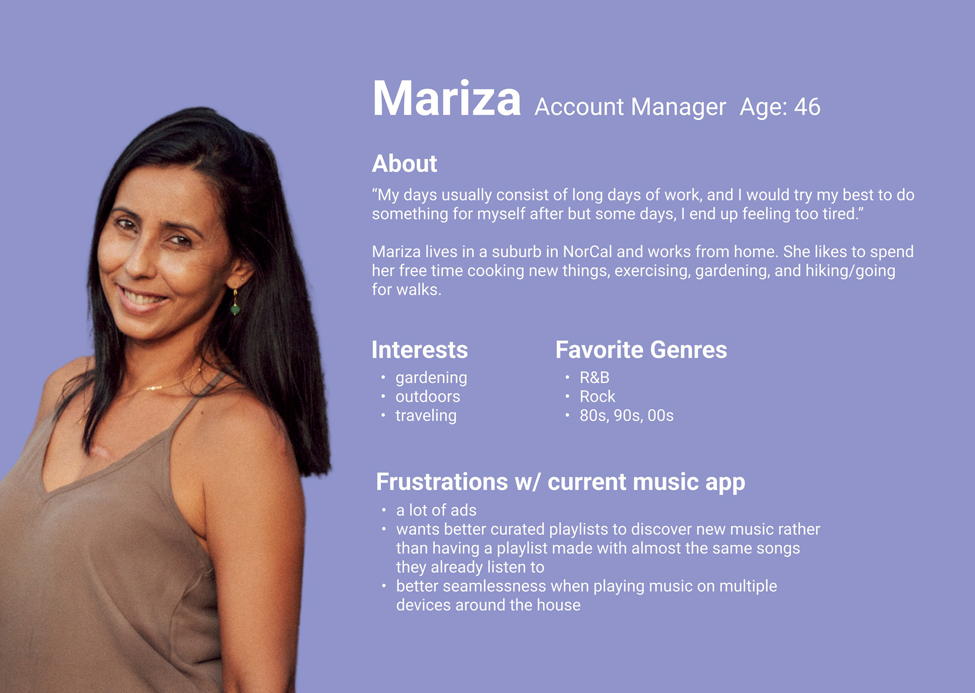
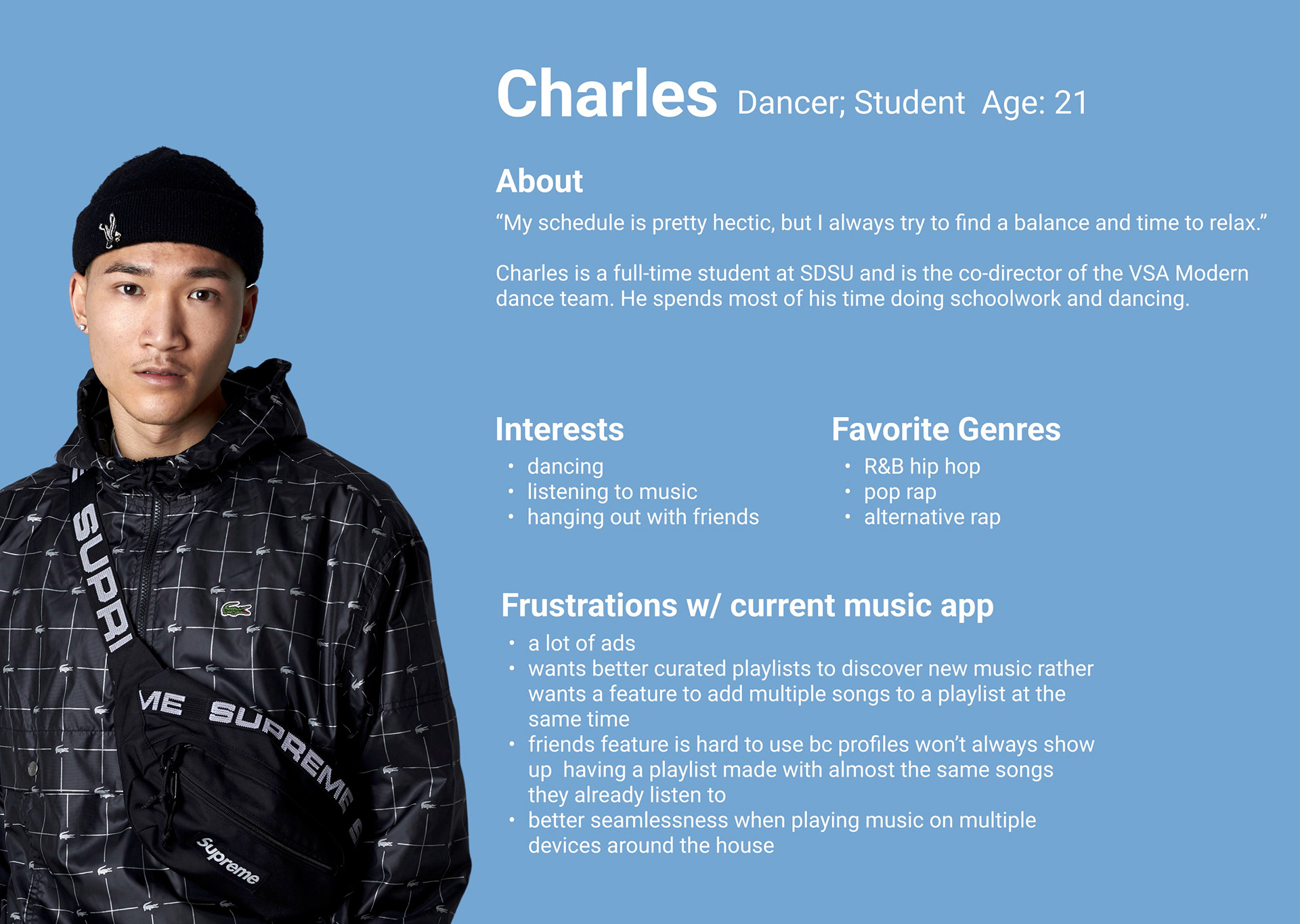
USER FLOW –
LOW-FIDELITY WIREFRAME –
phase 3 – PROTOTYPING & LOW-FIDELITY USER-TESTING
USER TESTING: LOW-FI PROTOTYPE
(USER 1 0F 4) –
Did you think anything was missing/confusing from the overall layout?
No, I found it quite comprehensive. Just needed options in every menu to do basic tasks such as adding songs. I liked how the library was presented as squares instead of lines.
How intuitive was each flow for you to understand?
Pretty intuitive. I feel like I got to the right spot every time on my first try.
How did you feel about the song/album/podcast of the day feature? What do you think we should change (add/remove)?
I think you should make it either only song of the day or every day you get one featured item in each category. It is less desirable as a roulette of what kind of content you might get each day.
How did you find the experience of using the app to complete these three tasks?
I thought it was fine. It still needs a lot of work, but the basic flow works fine and the details just need to follow. Definitely need to add elements that allow you to do the same task from a variety of different screens.
What did you think of the layout of the content?
I thought it was fine. I really liked how my library is organized in block features instead of in a list, I find that a lot easier to visually understand and organize, and I like that you can clearly see the picture covers for your playlists.
phase 4 – MOODBOARD, HIGH-FIDELITY UI, & DESIGN SYSTEM
MOODBOARD & DESIGN SYSTEM –
HIGH-FIDELITY WIREFRAME –
phase 5 – INTERACTIVE PROTOTYPE, USER-TESTING, & LANDING PAGE
USER TESTING: HIGH-FI PROTOTYPE
(USER 1 0F 4) –
Did you think anything was missing/confusing from the overall layout?
What is missing is being able to search and type songs individually by name (no actual typing feature). It is also missing some genres of music in the choose your top five genres section. I cannot think of anything that is missing, just add more details such as genres and searchable features. It would also be nice if more of the songs were actually capable of being interacted with and added to playlists.
How intuitive was each flow for you to understand?
The flows were a lot more intuitive than the initial prototype. Based on my first trial run and my general knowledge of music apps because of Spotify, it was very intuitive this time.
How did you feel about the song/album/podcast of the day feature? What do you think we should change (add/remove)?
Do not remove anything, I think it is perfect the way it is and it is very easy to understand and access. I wish this feature was real.
How did you find the experience of using the app to complete these tasks?
I found the experience to be much more intuitive than last time. I think anyone who has used any sort of music app in the past would be able to understand how it works and be able to navigate it relatively easily. I couldn’t do everything I was looking to do because a lot of the buttons weren’t working, so I would describe it as very intuitive but not fully functional.
What did you think of the layout of the content?
I think the layout was exactly as I would expect it to be on any music platform, but I thought it was even a little more creative. I like the colors of the recently played and I like that the album of the day is pinned at the top because it almost forces you to pay attention to new music, which is something that I am very interested in. It looks really cute and Spotify has some competition. If this were to be a real app on the app store, I think it would definitely force other music streaming platforms to reexamine their design strategy.
LANDING PAGE –
prototype
