UI OF THE WEEK –
CATEGORY
UI/UX
OBJECTIVES
User-Friendly Designs
Unique & Well-Structured Layouts
Applied UX/UI Rules & Guidelines
TYPEFACE
Varied
KEY WORDS
User-Friendly
Accessible
Aesthetic
Intuitive
PROJECT BRIEF
For the UI Of The Week (UIOTW) project, the objective is to create new, well-designed UI layouts once a week in response to the given prompt. The screens should each be compelling, well-designed arrangements that successfully represent each brand or theme. The typography and overall style of every design should be uniform, thoughtful, and reflective of the brand identity.
SOLUTION
For each solution, I addressed the prompt with a unique and and easily-understandable approach. I wanted to experiment with a variety of styles, color palettes, and icons, and chose varying themes and brand identities to accomplish these goals. Every screen is designed to be accessible and aesthetically pleasing, while clearly conveying the deliverables for the page as well as the purpose of each application.
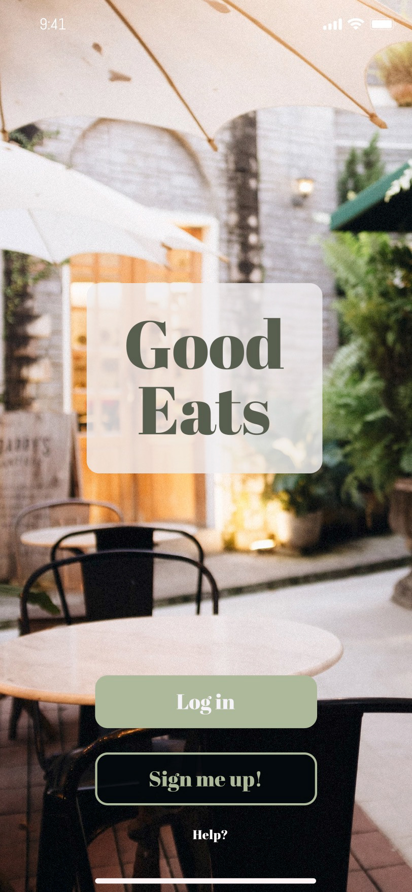
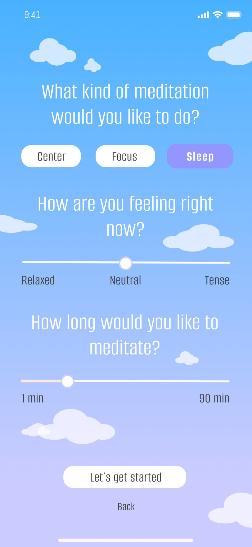
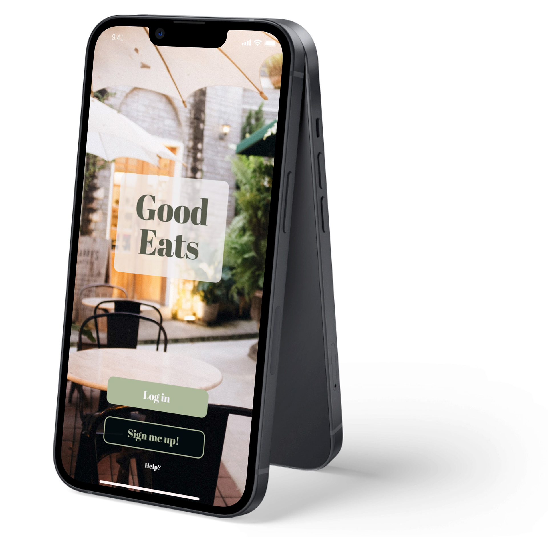
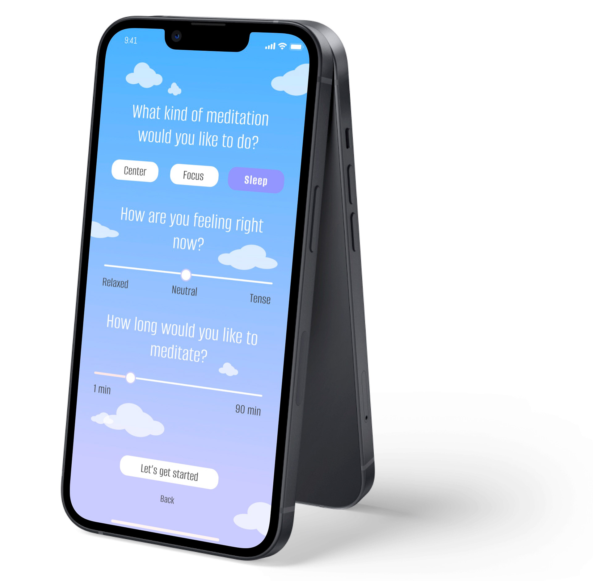
WEEK 1 & 2 - SIGN UP/LOGIN PAGE & BUTTONS + SLIDERS
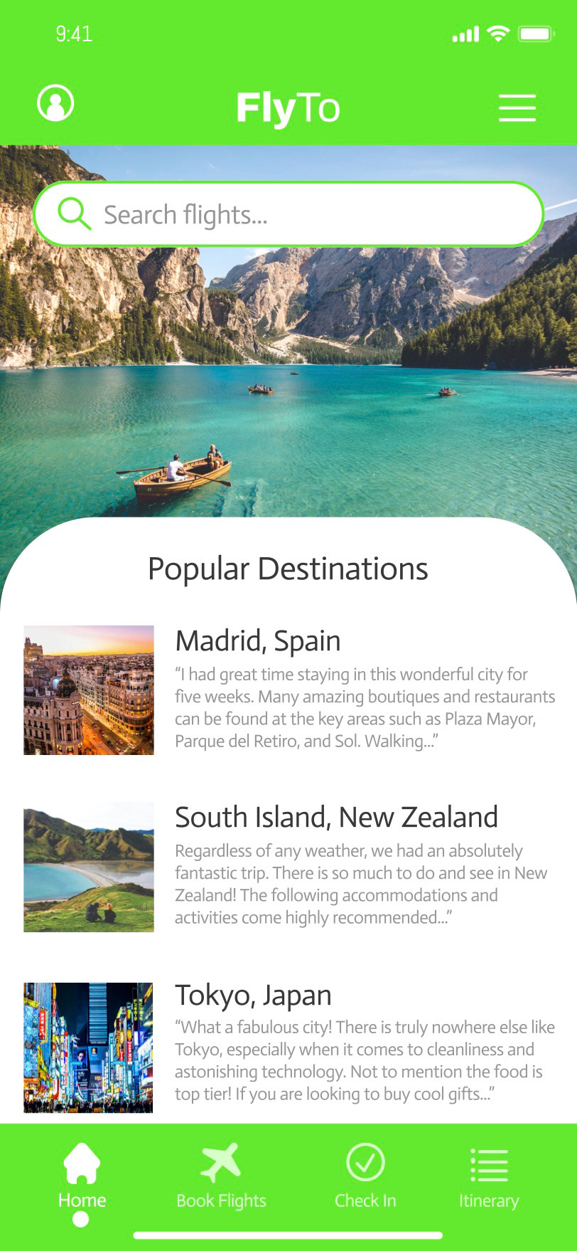
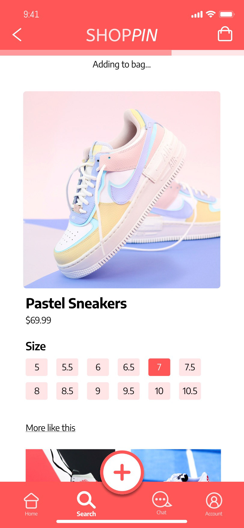
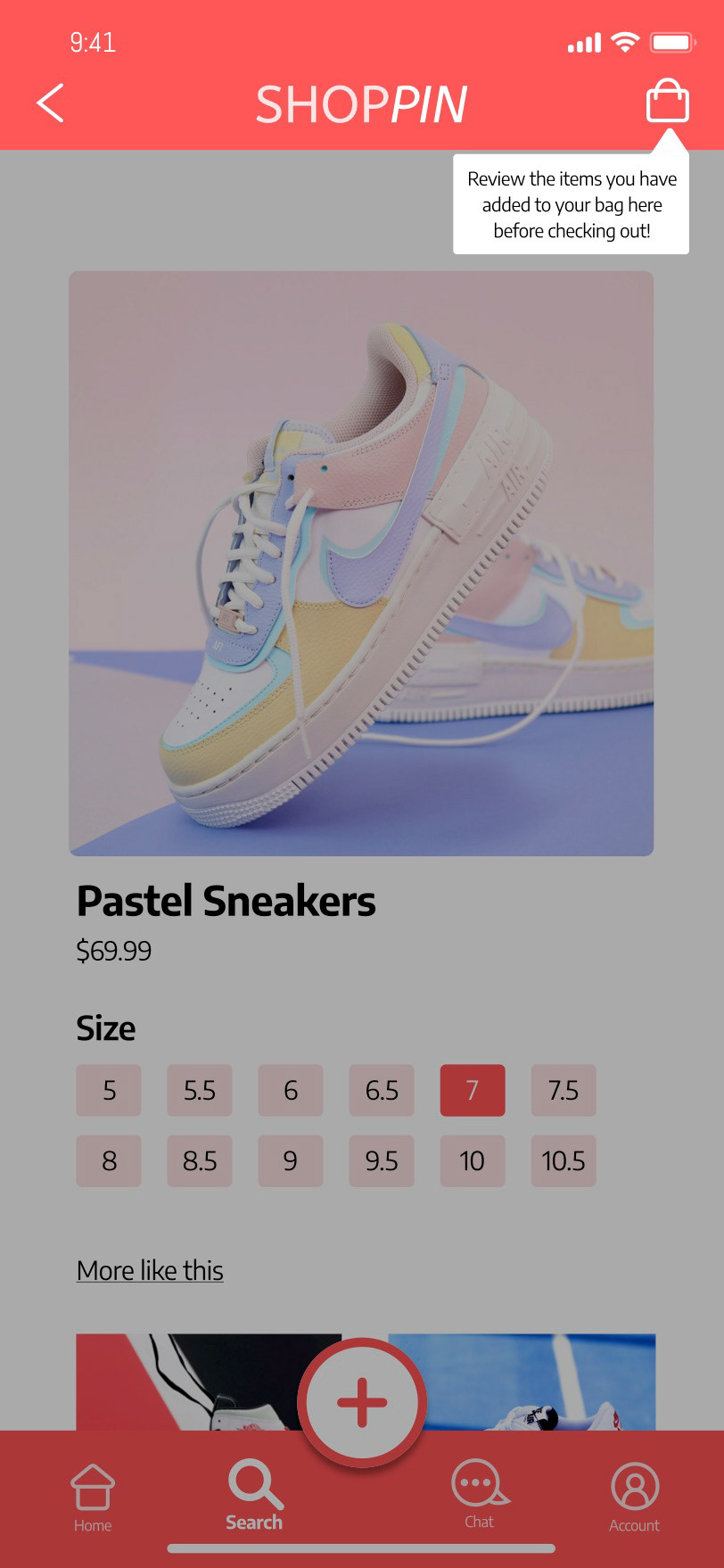
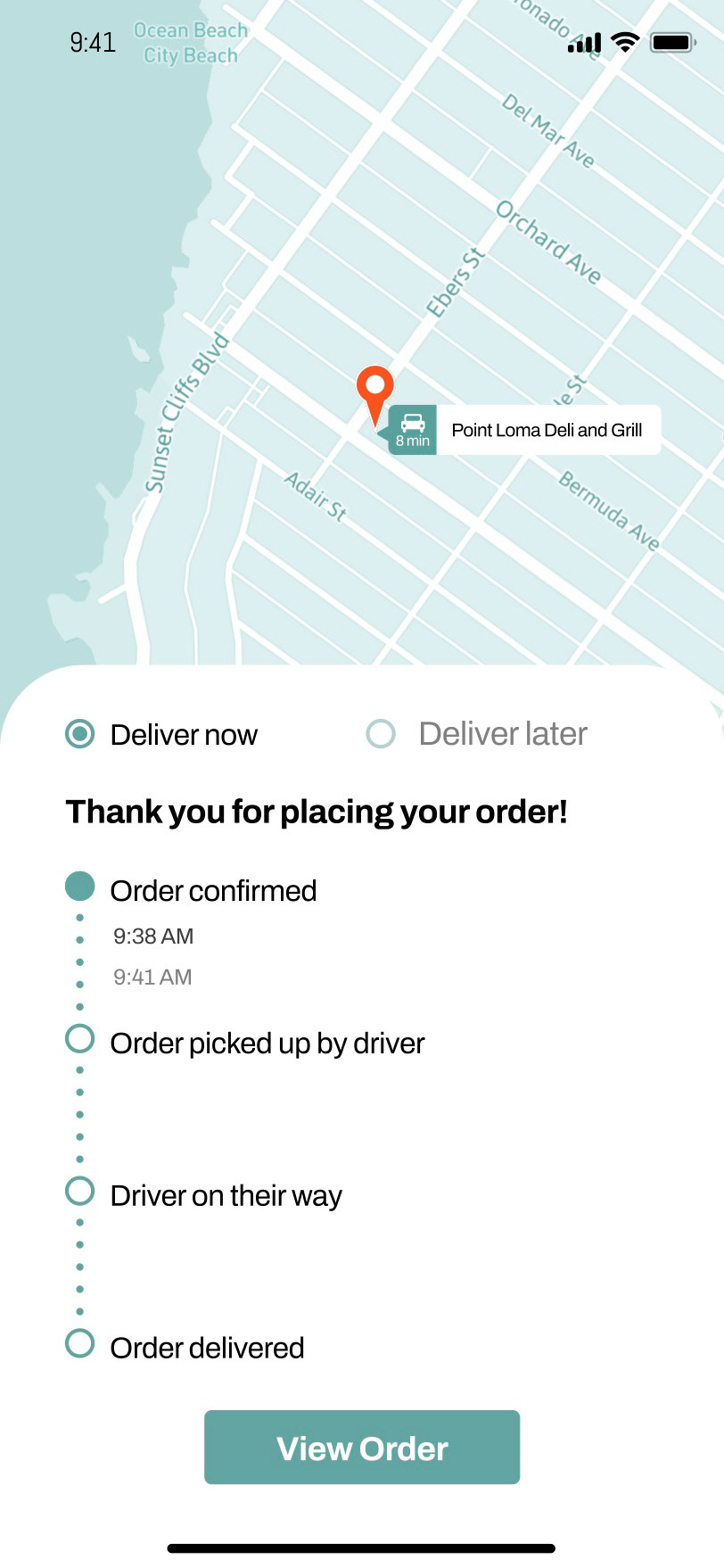
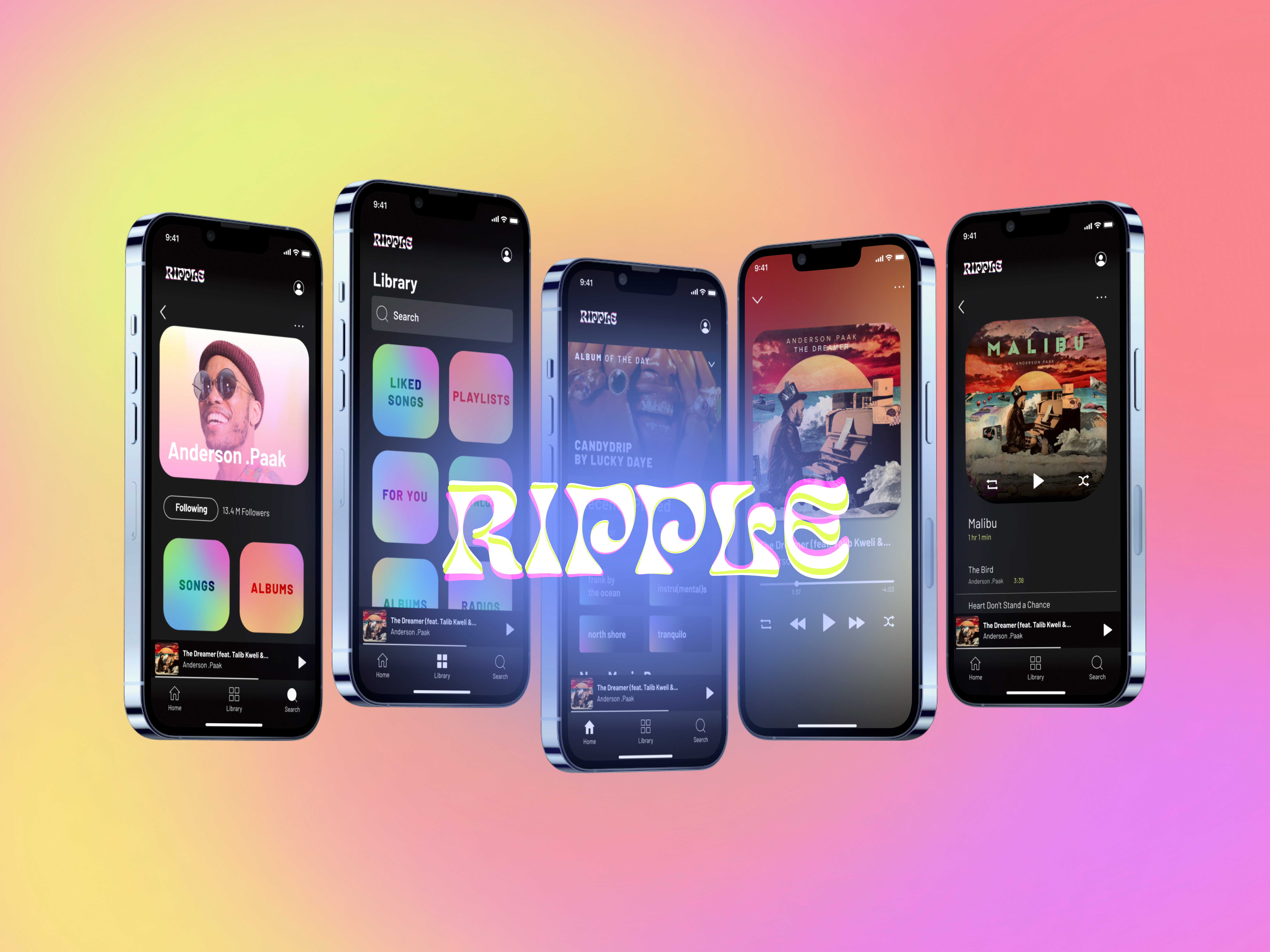
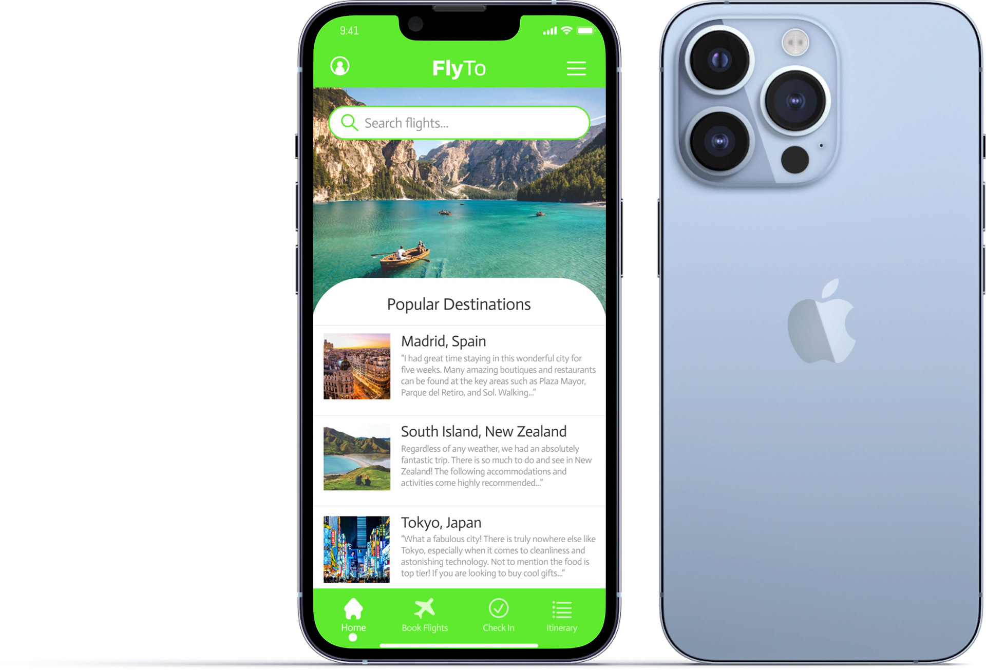
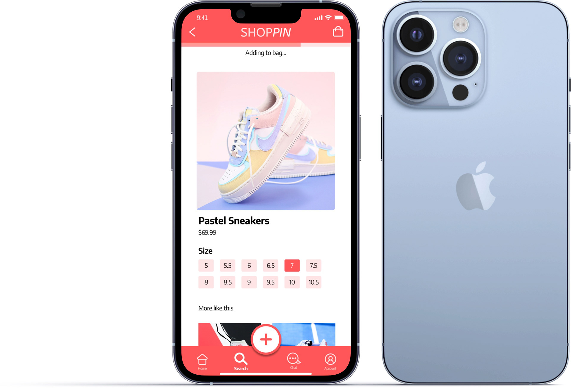
WEEK 3 & 4 - BOTTOM NAVIGATION BAR & APP BARS + PROGRESS INDICATOR
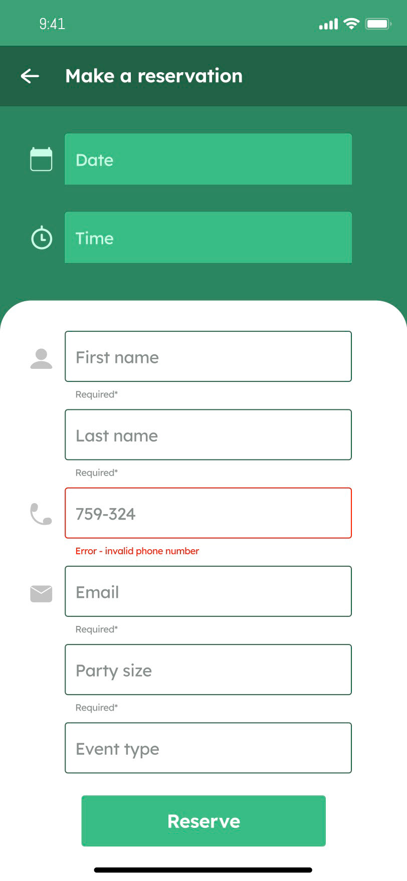
WEEK 5 - TEXT FIELDS + TOOLTIPS
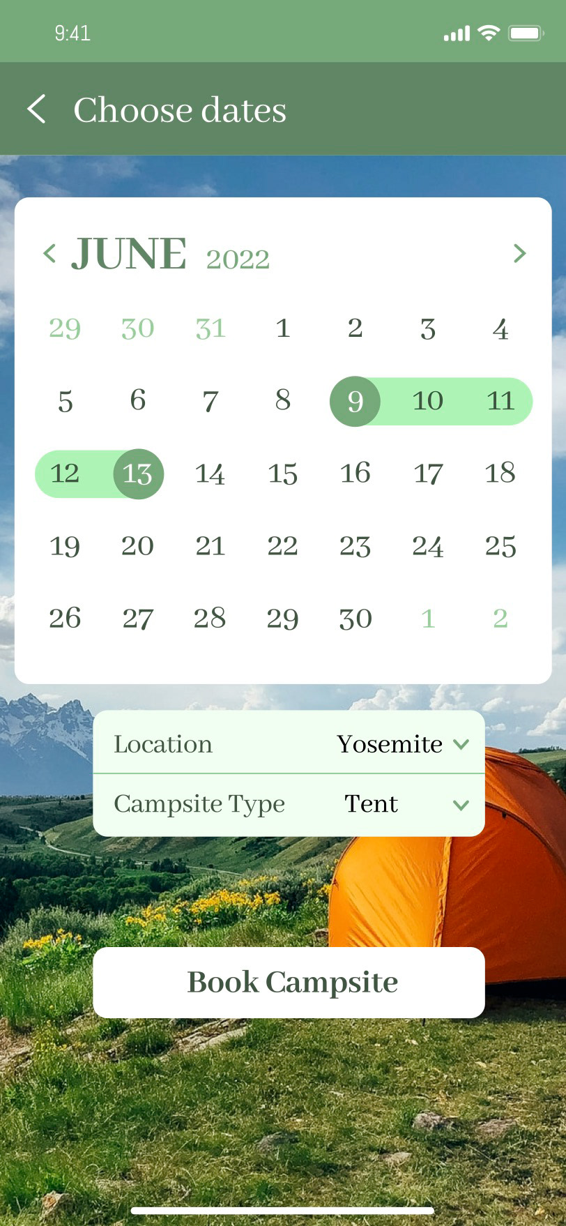
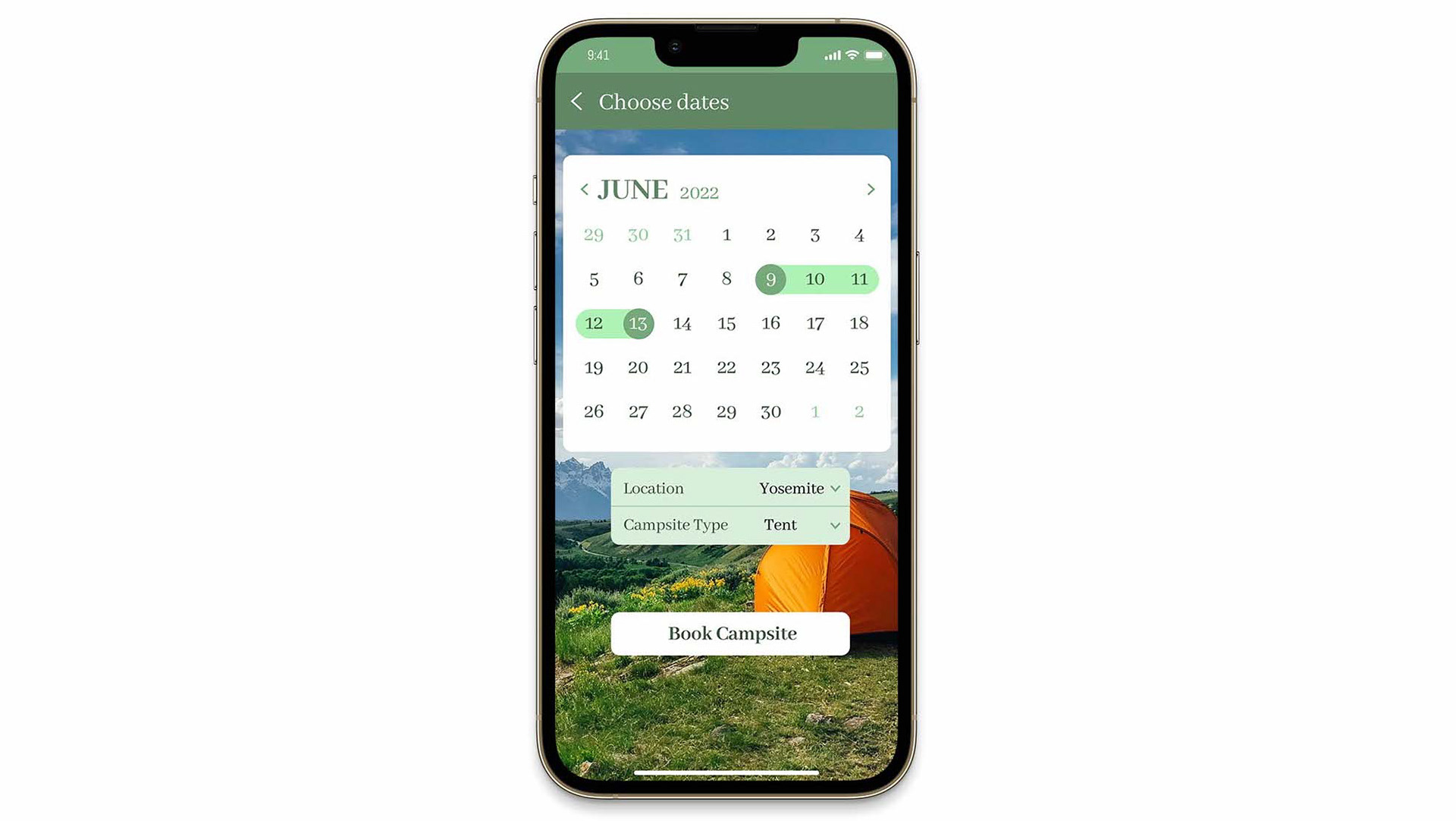
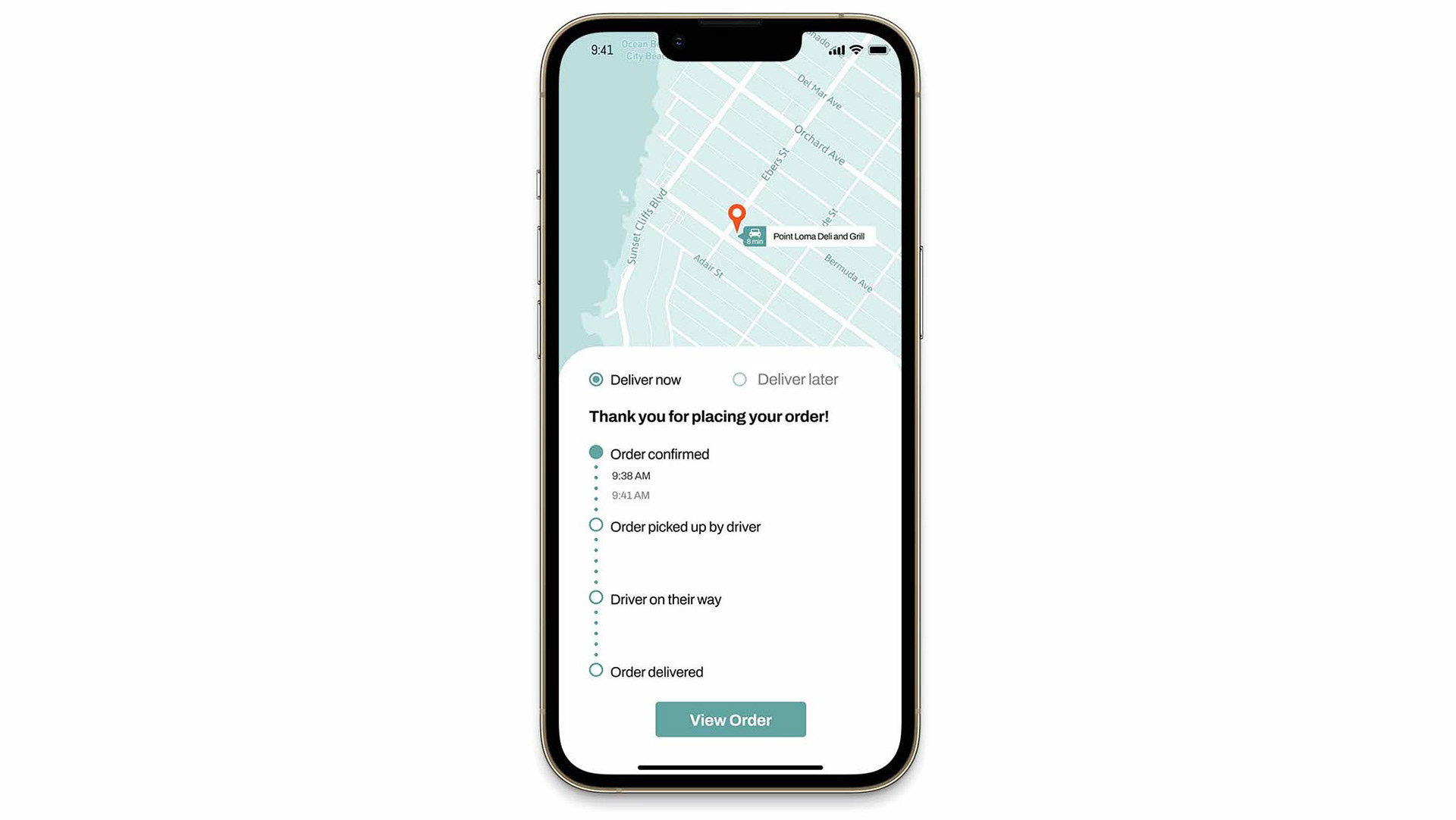
WEEK 6 & 7 - DATE PICKERS & MAP + SELECTION CONTROLS
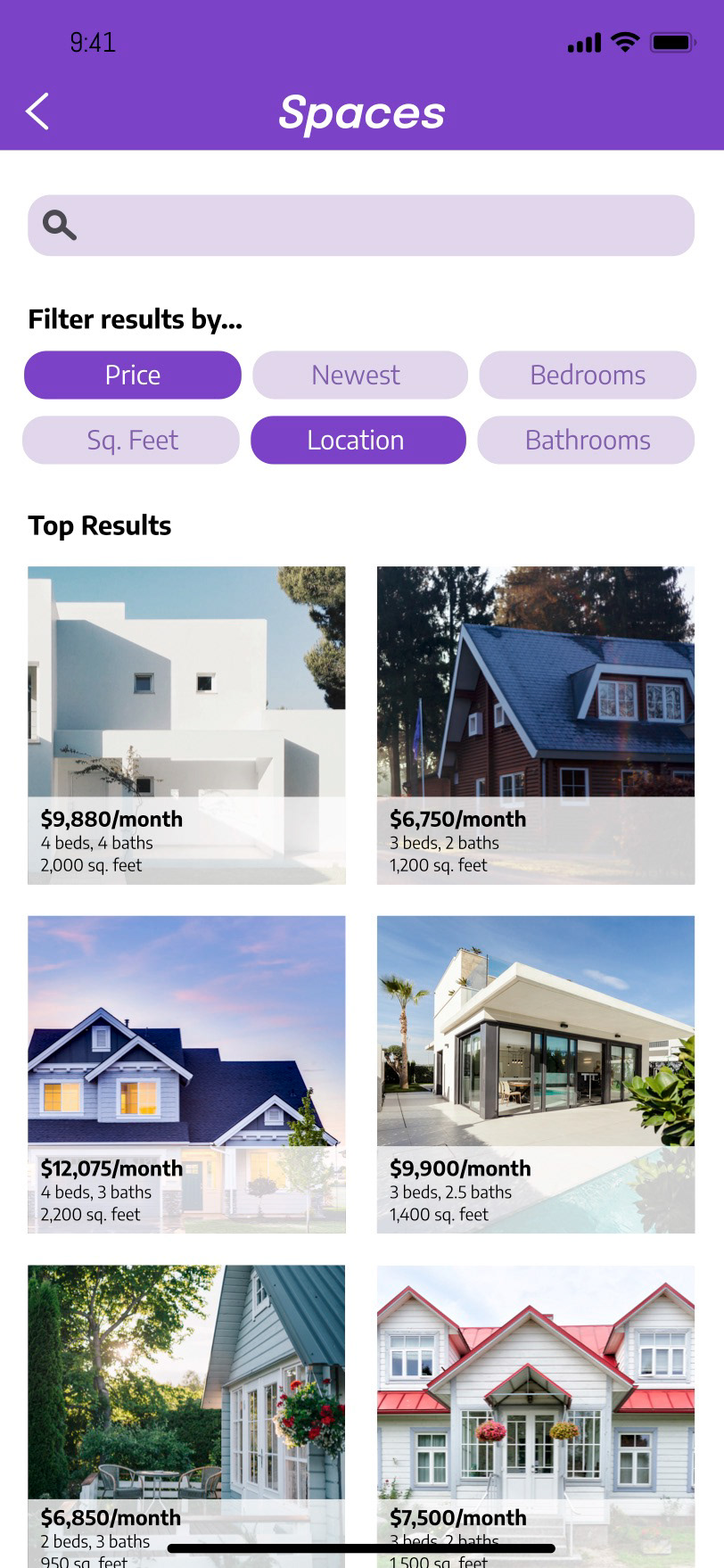
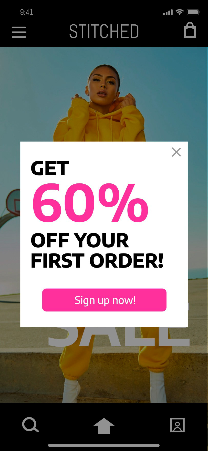
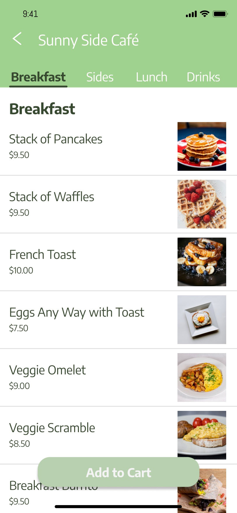
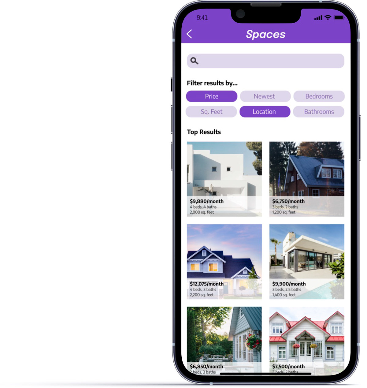
WEEK 8 & 9 - IMAGE LIST + CHIPS & MODALS

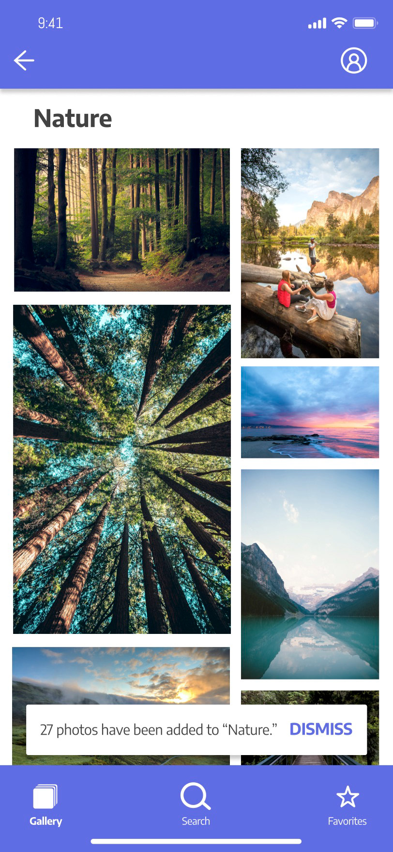
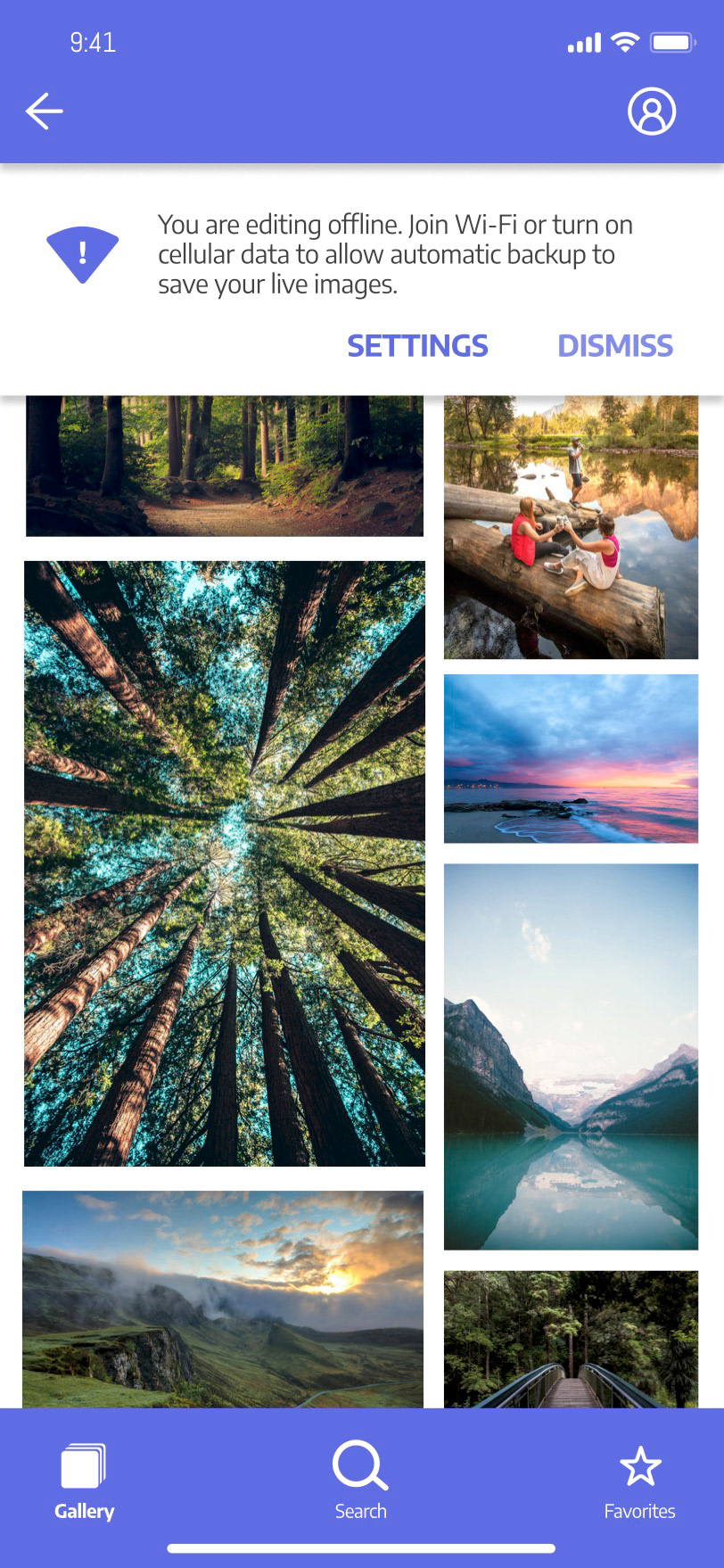
WEEK 10 - BANNERS + SNACKBARS
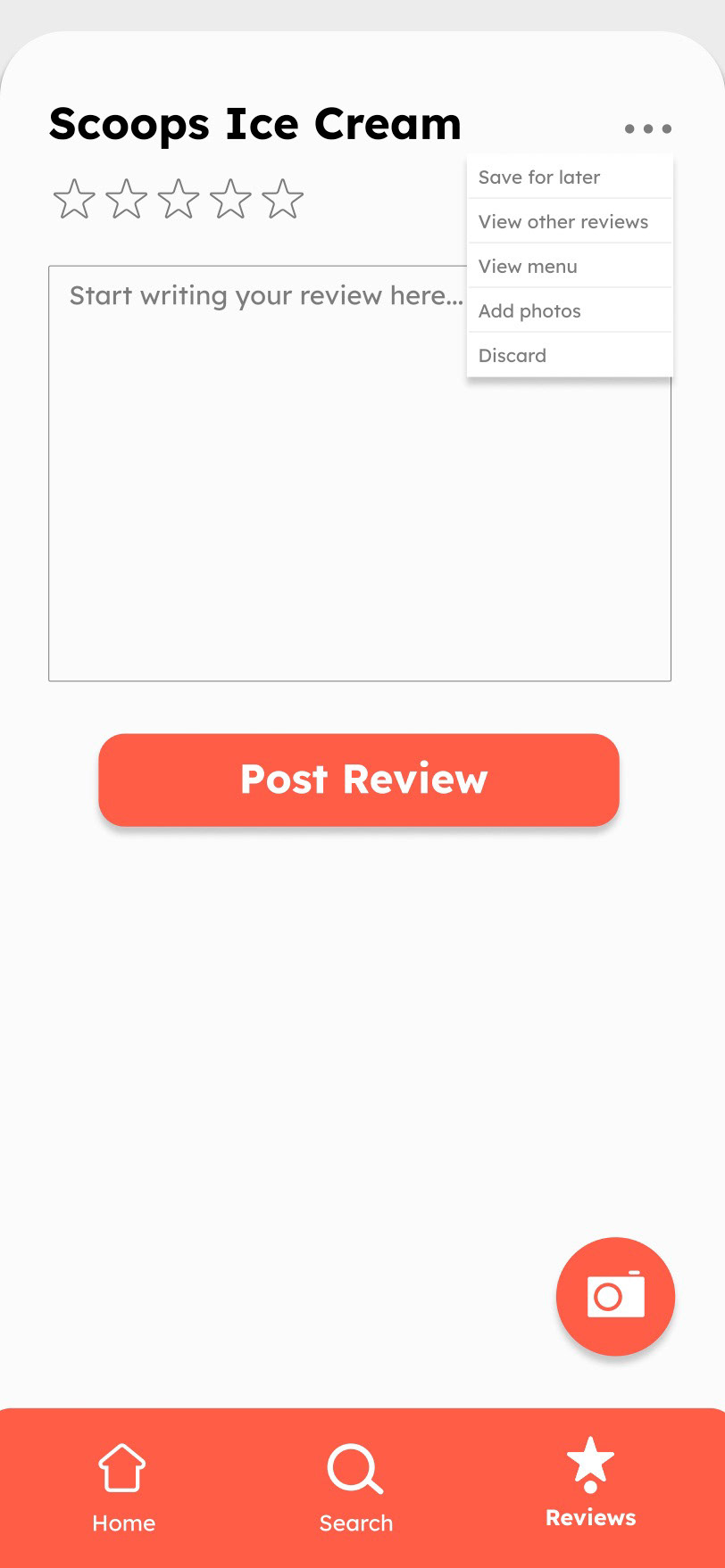
WEEK 11 - FILE UPLOAD + MENUS
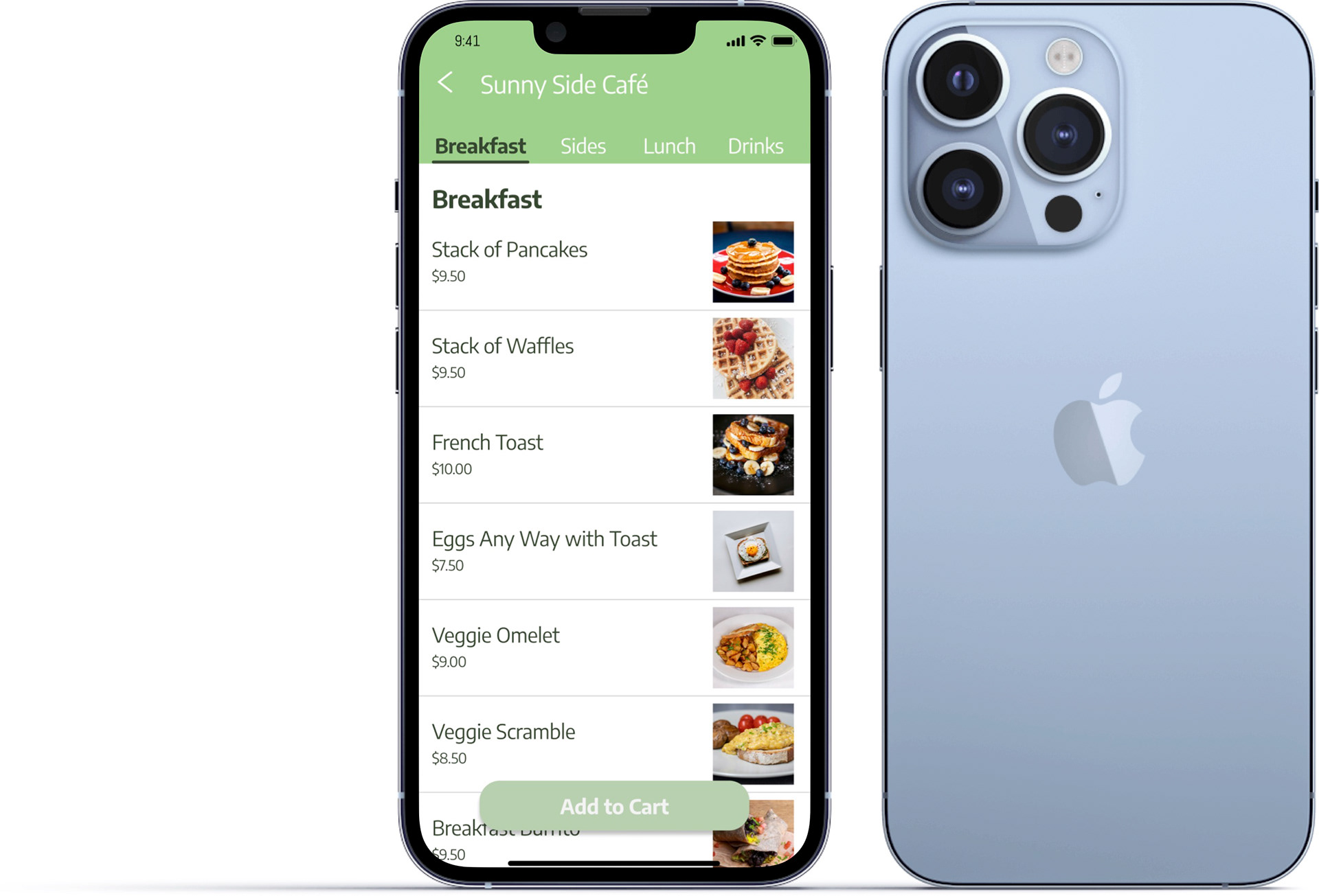
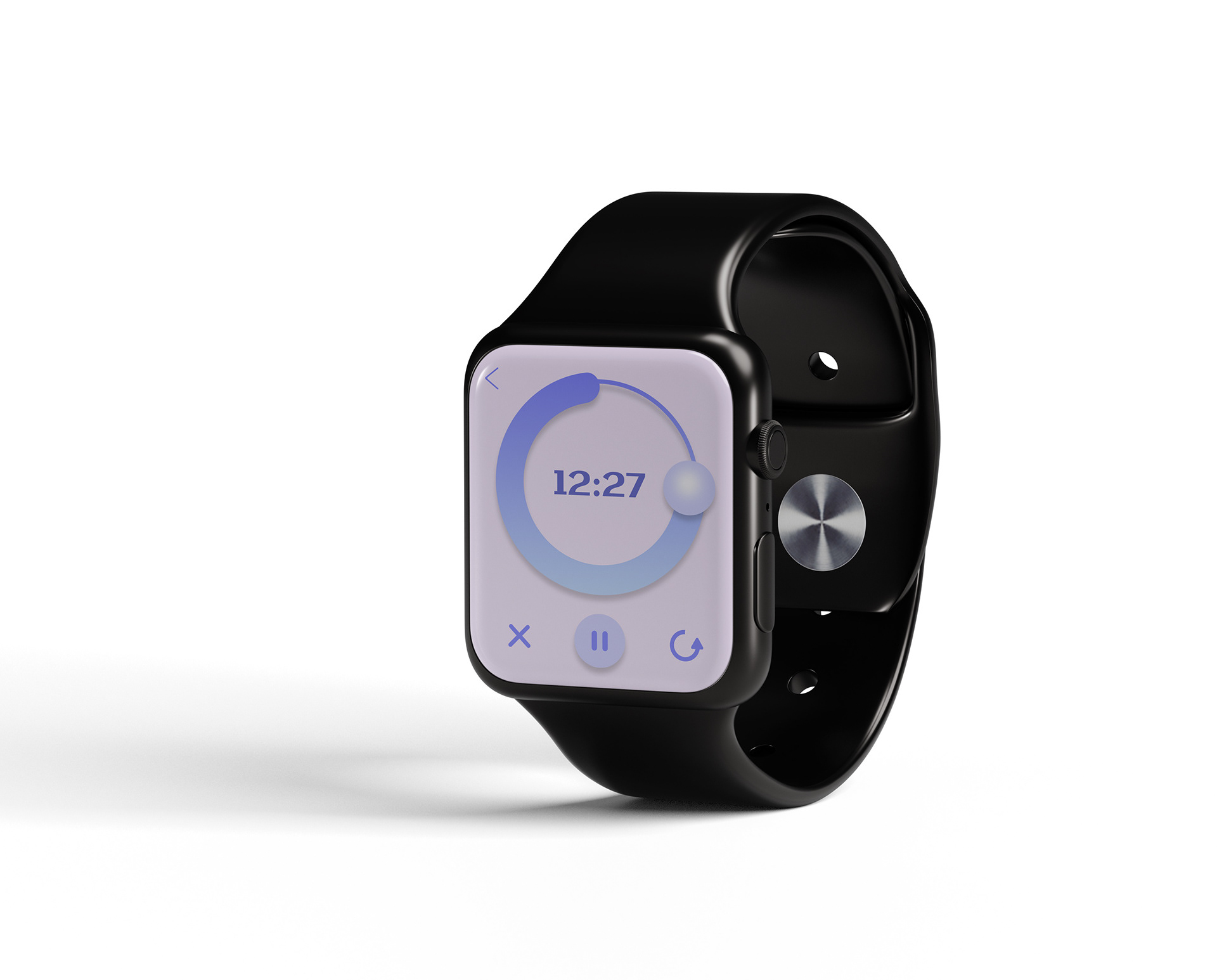
WEEK 12 - TABS + COUNTDOWN TIMER (APPLE WATCH)
SCREENS
